1 signup tactic that will ensure no prospect slips through the crack
I ditched Google Docs for Notion.
I wasn’t alone. There were others like me who shifted in impulse.
And then I realised. Their kick-ass product with the seamless sign-up flow is propelling conversions.
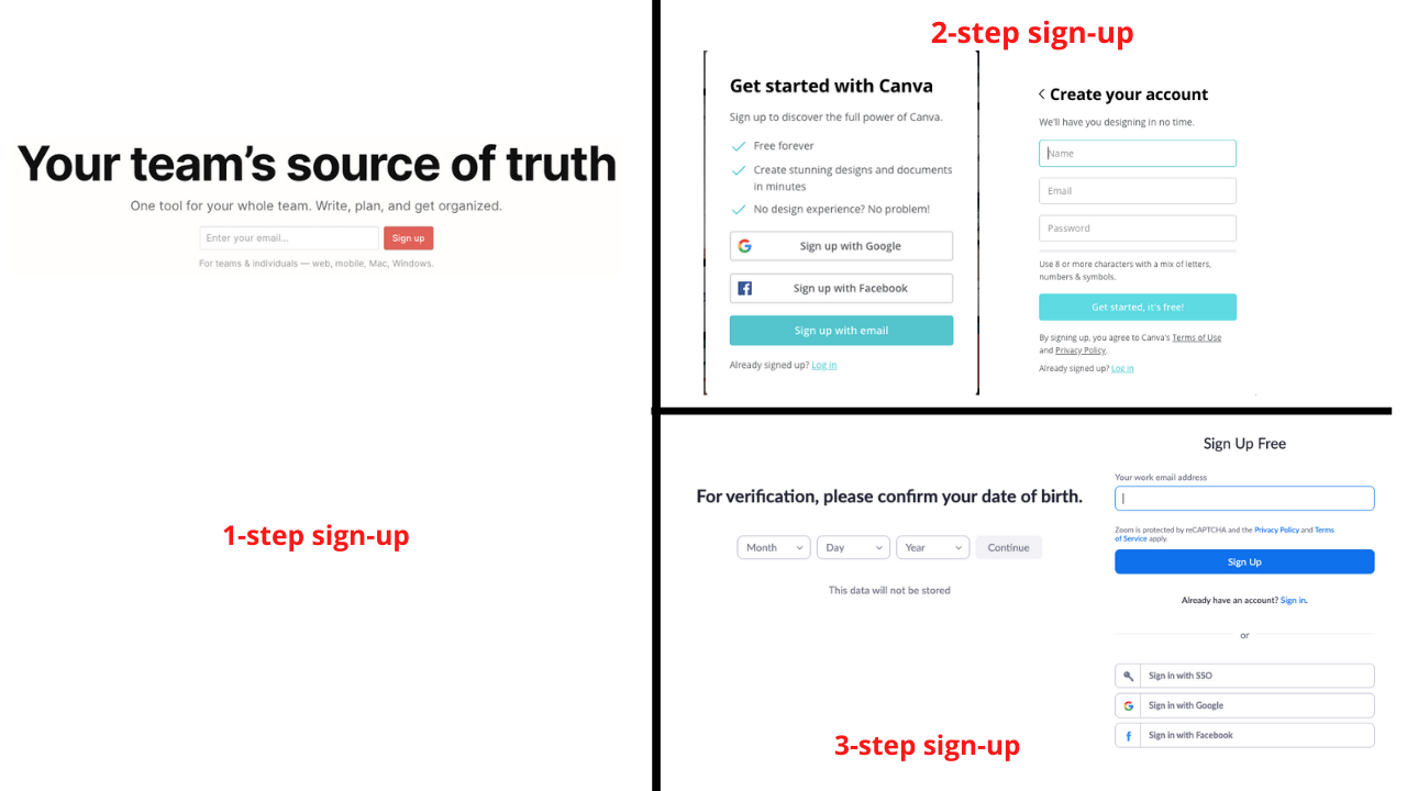
Whats’s special about their sign-up?
1 thing
Here’s Notion’s signup form. Post submission, you’re asked to confirm your email.
Compare that to other products trying to acquire free users. Multiple fields to fill unless you choose SSO.
Flexibility
The sign-up element can fit anywhere in the page without intruding the flow.
And boy, do they use it well? They have plugged the CTA for 5 times in this page.
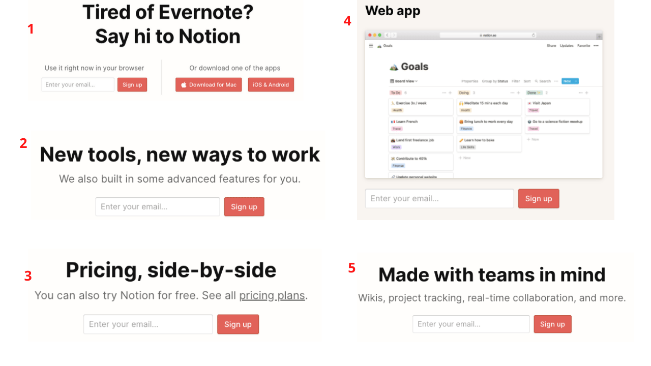
Make it 6. You scroll, top nav changes.
You’re just one step away from using Notion. Always.
Smooth
Does Notion not collect any info? It does. When THE critical action is performed i.e. signup
You’re then asked agree to T&Cs, answer a barrage of questions. That’s growth 101
Signup → Minimum effort
If you’re thinking sign-up forms, give yourself a $1000 for every field you remove.