I clicked on 4 ads and here’s the common thing between them.
I started my day with a coffee and an essay I had bookmarked to read. I started with one, read 2 , bookmarked a few. In this process I clicked on a few ads that’ve been following me (marketers I tell you!).
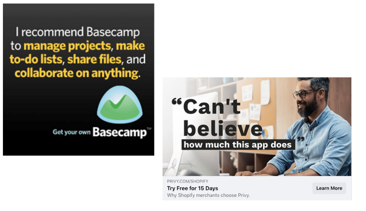
Social proof demonstrated brilliantly in both the cases. In Privy’s ad, it’s straight forward. However Basecamp uses a subtle expression of social proof by starting with “I use…”
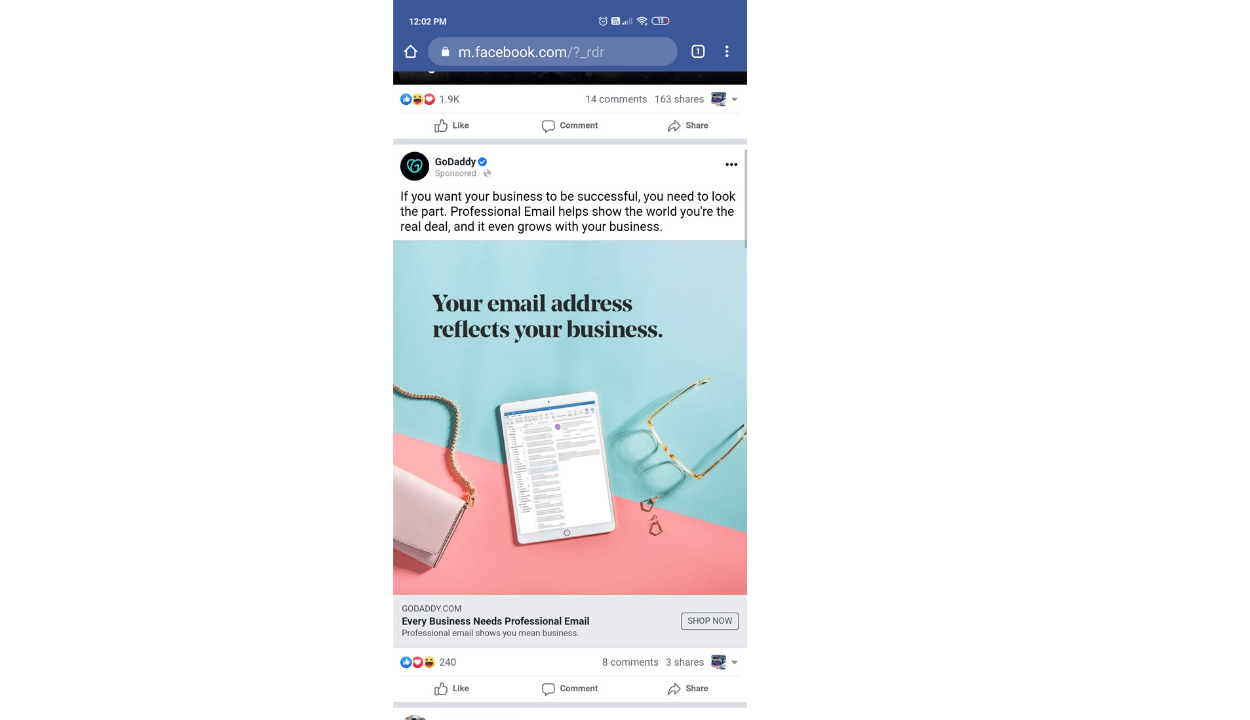
Example-2- [Godaddy](godaddy.com)
I purchased a domain on GoDaddy and didn’t purchase the email service that came along. Guess who chose to remind me? Ofcourse, I budged.
Example-3- Andaman
I wanted to upgrade my wardrobe. Fashion brands have been bombarding my social feed. One ad stood out. And I ended up buying from them.

What’s common between all of them? (Apart from my click)
- They tried to communicate only one thing.
- They highlighted only ONE benefit (Godaddy)/ social proof (Basecamp)/ one offer (Andaman) to me.
- One ad, One message.