Millimatters

Millimatters will have stuff about marketing, books and general musings. Each piece will be under 150 words, and will take less than 2 minutes for you to read.

Page 2


Selling the Scare? Here’s 4 Things to be Mindful.

It was a fuzzy afternoon. I was reading an article on productivity, and tweeted about it (oh! the irony). Then a casual browse in my Facebook feed, I purchased something.

The ad that made me buy

Screenshot_2020-07-14_at_11.34.12_AM.png

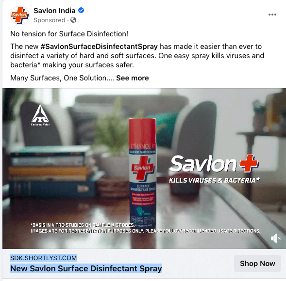
A sprayable disinfectant- The one that would kill “99.99%” bacterias on surfaces.

I purchased out of the fear of contracting an unknown infection.

Fear causes stress. And stress induces a reaction. Often a purchase.

I observed others ads that used fear to sell, and noticed a pattern.

  • A widely-acknowledged fear (surface infection because of COVID)
  • A very specific solution to the threat (Sprayable)
  • The prospect perceives that it’s the solution (I knew Savlon as a disinfectant)
  • The prospect believes that he or she can solve it themselves (It was a video ad)

So, next time you give a stick see if you satisfy these 4 aspects :)

Continue reading →


1 signup tactic that will ensure no prospect slips through the crack

I ditched Google Docs for Notion.

I wasn’t alone. There were others like me who shifted in impulse.

And then I realised. Their kick-ass product with the seamless sign-up flow is propelling conversions.

Whats’s special about their sign-up?

1 thing

Here’s Notion’s signup form. Post submission, you’re asked to confirm your email.

Compare that to other products trying to acquire free users. Multiple fields to fill unless you choose SSO.

Notion-Signup.png

Flexibility

The sign-up element can fit anywhere in the page without intruding the flow.

And boy, do they use it well? They have plugged the CTA for 5 times in this page.

Add a little bit of body text.png

Make it 6. You scroll, top nav changes.

You’re just one step away from using Notion. Always.

Smooth

Does Notion not collect any info? It does. When THE critical action is performed i.e. signup

You’re then asked agree to T&Cs, answer a barrage of questions...

Continue reading →


Can shocks drive home a point?

Surprise elements leave a memorable experience. Positives can be positive and negative.

For long advertisers have used positive reinforcements like incentives, freebies, going the extra-mile to leave a positive impact.

But can negative surprises drive home a point? Find out from these 3 examples.

UNICEF
UNICEF created this film to convey a serious problem- child marriage. Around 15 million girls get married before they turn 18. Notice how they reveal the shock towards the end.

Bangalore traffic police
We lose a lot of lives to road accidents. The brilliance of ad is in shifting the perspective from the driver to the person on the other side. The best way to convey that both parties are responsible.
Untitled design (3).png

British Heart foundation
BHF came up with this advert to fight their biggest enemy- eating crisps. The ad was focussed to drive more healthier eating habits.

Untitled design (4).png

The shock element in...

Continue reading →


An elegant way to think about email outreach

There’s enough written about email outreach. Playbooks, scaling efforts, countless templates leading to sky-rocketing results.

But I want to propose a more elegant way to outreach. The ones that will be timeless. You will never look like a spammer :)

Let’s go!

Ditch your template- Influencers know it’s a template. If your templates like is one of these. Throw that away. Be genuine.

Screenshot 2020-07-13 at 6.08.31 PM.png

Incentive- Think- ‘Why should they care’? If you can’t answer, don’t send that email. Incentives could be a piece of information, including their quote, feedback/counter view etc. Answer the ‘why’ before hitting send.

Don’t just keep asking- Remember that annoying friend who keeps calling you to ONLY ask for help? Do you pick his/her call? Don’t be THAT person. Bloggers/influencers are humans. Try to create a rapport, just like you would do with a friend.

An example-

Screenshot 2020-07-13 at 6.02.39 PM.png

Quality first-...

Continue reading →


Can you do all of this in 30 seconds?

It’s rare for an advertisement to become part of social conversations.Factors like concept, copy, production, and story need to resonate with the audience.

And this becomes more challenging if it’s television. The ads are expensive, and you have little time.

Two examples- One each from the US and India.

And both became part of social conversations.

**Example-1: Direct TV**

The “Get Rid of Cables” campaign starts with a humble scenario and escalates to hypothetical, far-fetched and regrettable endings- All for not buying Direct TV.

Their youtube comments section full of hypothetical scripts. Talk about virality.

**Example-2 : Seagram’s**

The ads focus on how men behave in vicinity of women to attract their attention and seeming stupid in the process. It has tongue-in-cheek written all over it.

The success “Men will be men” campaign is in toning down the toxicity of the...

Continue reading →


25 days!

It’s been 25 days since Millimatters was started. That’s 25 days writing 150 words continuously. I sat down to write about an advertising series. But that can wait.

Why? Because, I want to use this pitstop to give a shoutout to people who have critiqued me, nudged me, validated my ideas and supported me all through. Everytime I was clouded with self-doubts, they pushed me.

Here’s to them, in no particular order :)

Karthik Pasupathy- He’s been a constant source of encouragement, always giving very pointed feedback. You can read Karthik’s work here, here and here.

Vignesh Sairam- Most you see on Millimatters have been refined by Vignesh. Always keeps a check on the fact that the posts don’t become ‘preachy’. Someone who doesn’t mind giving me the stick if things don’t seem good.

Naveen Kumar- If there was someone who’s read every single post apart from me, it’s him. You can read...

Continue reading →


I clicked on 4 ads and here’s the common thing between them.

I started my day with a coffee and an essay I had bookmarked to read. I started with one, read 2 , bookmarked a few. In this process I clicked on a few ads that’ve been following me (marketers I tell you!).

Example-1 of Privy & Basecamp

Social proof demonstrated brilliantly in both the cases. In Privy’s ad, it’s straight forward. However Basecamp uses a subtle expression of social proof by starting with “I use…”

Ads I clicked (3).png

Example-2- [Godaddy](godaddy.com)

I purchased a domain on GoDaddy and didn’t purchase the email service that came along. Guess who chose to remind me? Ofcourse, I budged.
Ads I clicked (1).png

Example-3- Andaman

I wanted to upgrade my wardrobe. Fashion brands have been bombarding my social feed. One ad stood out. And I ended up buying from them.

Ads I clicked (2).png

What’s common between all of them? (Apart from my click)

  • They tried to communicate only one thing.
  • They highlighted only ONE benefit...

Continue reading →


A differentiator your competitors cannot copy

Transparency in advertising is underrated. It can be a differentiator. A non-replicable one. It’s a fine line to walk. How far can brands go? As long as you stand by what you say :). 4 brands, 4 lessons.

Nestle

Nestle introduced Nutri-score across their products in Europe. The score indicates how healthy/unhealthy a product is. The move was aimed at making consumers make ‘informed’ decisions.

Transparency.png

Traffic Think Tank
A paid community for SEO folks, the page elaborates reasons why you need to join them. They round it off with a clear messaging- The community isn’t a magic bullet. Helps the user with decision making.
Untitled design (2).png

Basecamp
Basecampdetails out every detail possible for a refund. Transparency can’t get better.
Transparency (1).png

Buffer

Buffer=Transparency. They have every detail about their company out there. Revenue, spend, editorial calendar, etc are published eEven the books they read).

Transparency (2).png

...

Continue reading →


Flaws as a brand differentiator

Admitting to one’s weakness may be a counter-intuitive way to establish trust. Imagine coming up with collaterals on why people SHOULDN’T buy your product. And selling to them in process.

Can you be successful with that? Three examples.

Dominos

In 2009 Dominos was making a comeback. They had consumers bad-mouthing them. Dominos launched a slew of self-deprecating campaigns on “Sorry for sucking” starting their turnaround.

They focussed on

  • Acknowledging their pizza sucked and what they did about it.
  • Using only original pictures (and not trick shots).

Pepsi

For many, Pepsi is a second choice. What if Pepsi chose to address it? The ad titled “Pepsi- More than Ok” was launched during NFL-19. Pepsi pokes fun at itself around the popular perception. Watch.

Avis
Avis car rental addresses why you should choose them over Hertz. Real and relatable.
Avis.jpeg

It’s important to be...

Continue reading →


5 homepage examples that will dispel your myths

  • Myth-1- Homepage needs to be generic and vague to appeal to a wider TG.

  • Fact- They should be as narrow as possible. Be specific.

Substack’s homepage addressing a specific group.

Homepage copies.png

  • Myth-2- Being specific reduces your scope
  • Fact- It is okay to address a very targeted group of people to whom your product might be the lifeline. Be everything to someone.

Basecamp’s homepage for remote teams.

Homepage copies (2).png

  • Myth-3- You need to use industry words like ‘supercharge’, AI first or
  • Fact- Express what your product solves. Nothing more, nothing less. puns.

Canva’s homepage- Changed since I wrote.

Homepage copies (1).png

  • Myth-4- You might sound scammy for making bold claims.
  • Fact- If you are confident that your product will deliver on the promise, make it in the most impressive way. If your claim comes with a condition, state that.

UseFYI’s homepage talking about a bold claim
Homepage copies (3).png

  • Myth-5- I should have a...

Continue reading →